Client: FIRST Insurance Funding
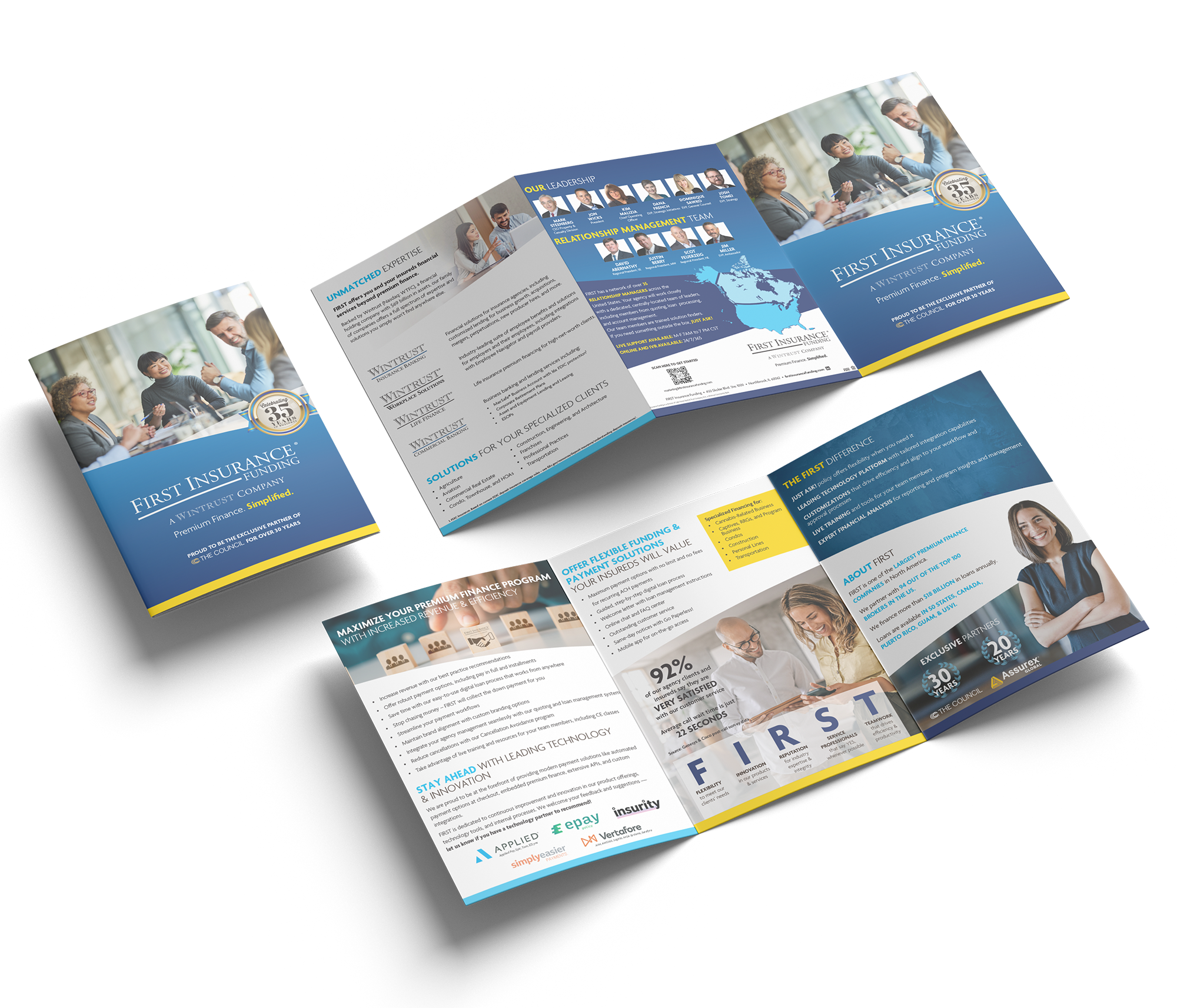
Brief: (Oversized Tri-fold Brochure) Create a high-impact print asset for distribution at an annual Council of Insurance Agents & Brokers C-suite event, positioning FIRST Insurance Funding as a leading force within the premium finance industry. The piece needed to communicate credibility, scale, and industry leadership through a polished and visually cohesive presentation tailored to an executive audience.
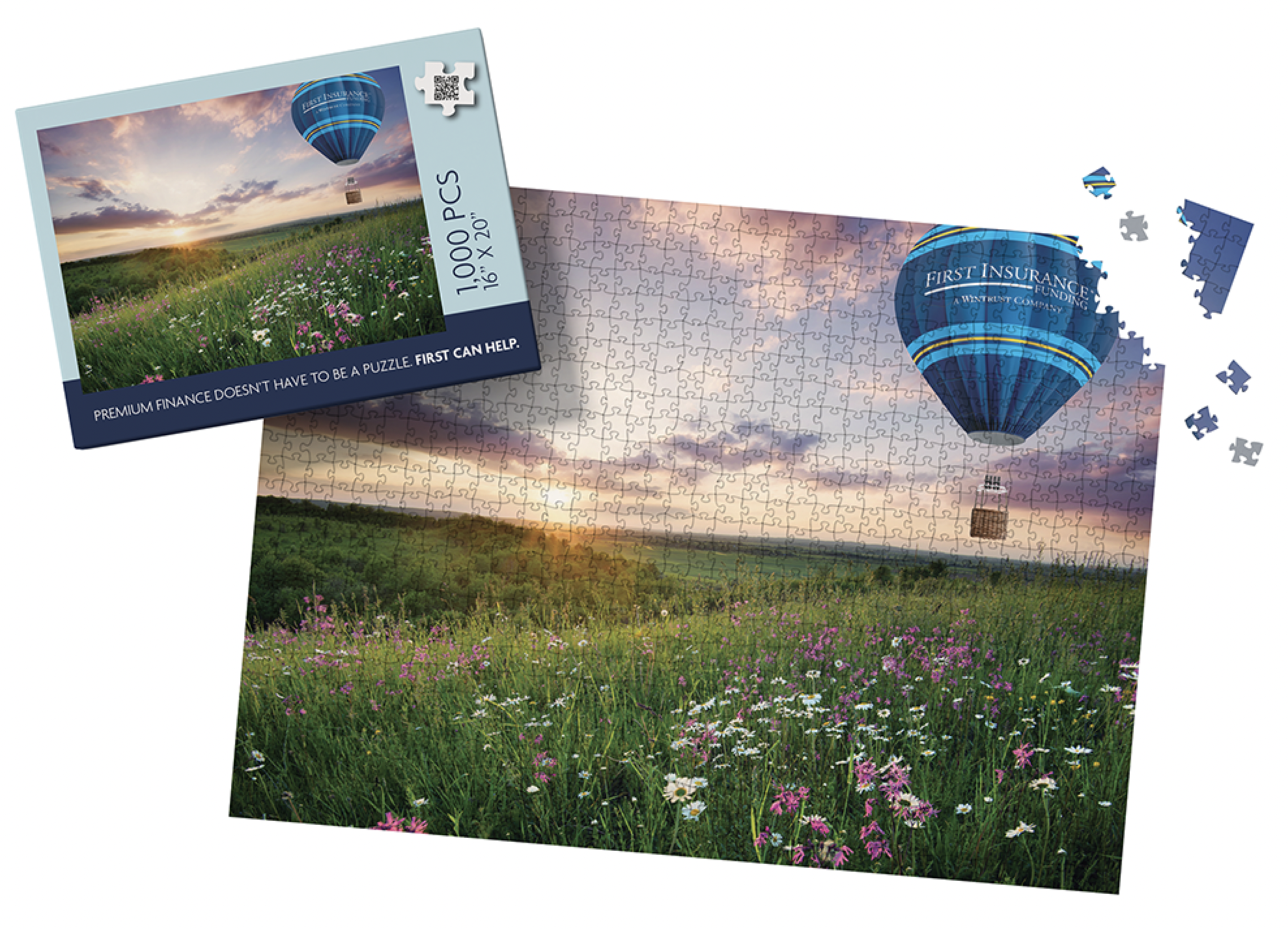
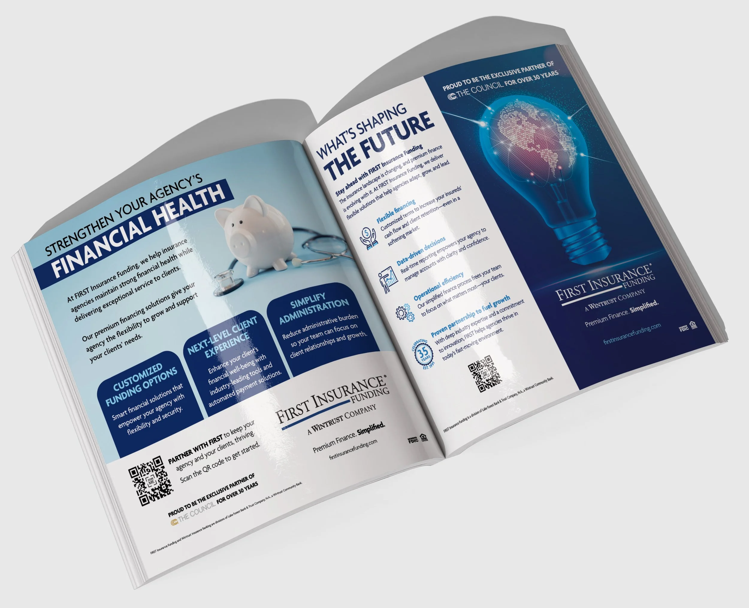
Brief: (Print Magazine Ads) Develop a series of monthly full-page advertisements for Leader's Edge that align with the publication’s editorial calendar, annual themes, and industry events. Each ad needed to communicate complex business and financial concepts in a visually engaging and approachable way while maintaining consistency with the brand’s professional voice and industry positioning.
Fun Fact: Premium finance isn’t exactly light reading—so how do you make it engaging in print? I used bold brand color blocks, simplified photography, and punchy copy to break the information into digestible pieces.
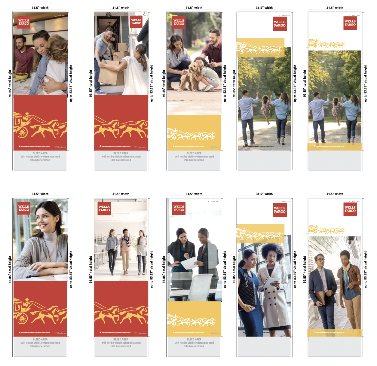


Client: Wells Fargo (3D Exhibits)
Brief: Design a collection of retractable banner stands for Wells Fargo to be used across retail locations, corporate environments, and trade show events. Each banner needed to support a distinct business line — including Consumer Lending, Commercial Banking, Investment Banking, and Wealth Management — while remaining visually cohesive within the larger Wells Fargo brand system.
Fun Fact: Before accessing any of Wells Fargo’s digital assets, designers must complete an in-house brand certification course — an extra step that helps ensure every piece of creative remains perfectly aligned with the company’s brand standards.
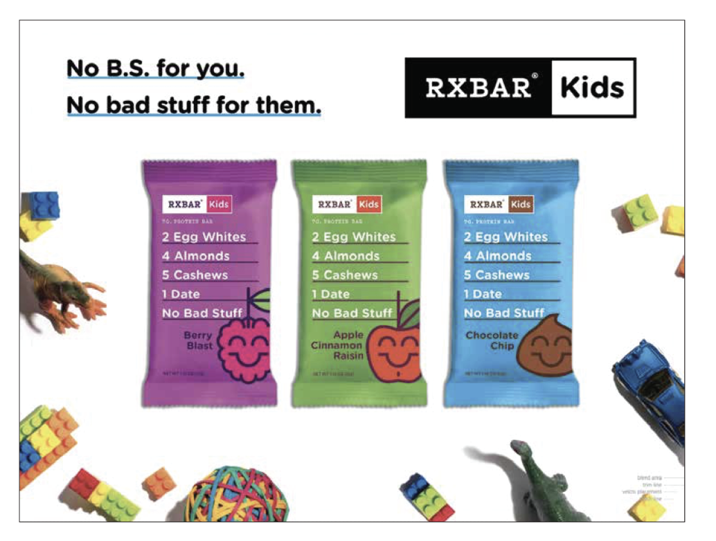
Client: RXBAR (3D Exhibits)
Brief: Design a large-scale environmental backwall graphic for RXBAR promoting the RXBAR Kids product line. The display needed to combine playful nostalgia with clean, modern branding to create an engaging visual experience that resonated with parents while remaining true to the brand’s transparent and straightforward identity.
Fun Fact: The intentional use of expansive white space throughout the composition was designed to embody the simplicity of childhood — visually reinforcing the campaign message: “No B.S. for you. No bad stuff for them.”
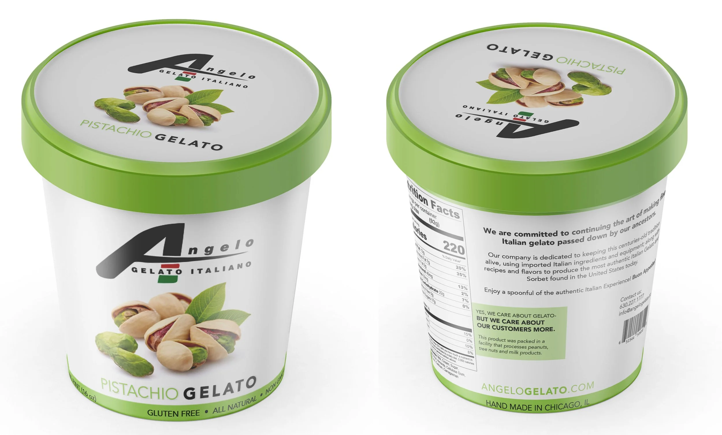
Client: Angelo Gelato Italiano.
Brief: Redesign the line of gelato pint containers for Angelo Gelato Italiano with a focus on improving shelf visibility and flavor differentiation within a highly competitive retail environment. The new packaging system needed to feel modern, fresh, and premium while creating a cohesive look across multiple flavors
Fun Fact: Angelo Gelato Italiano offers 12 retail pint flavors, but produces more than 100 specialty gelato varieties for regional restaurants and food service partners. Pistachio was easily my favorite flavor while working on the project.
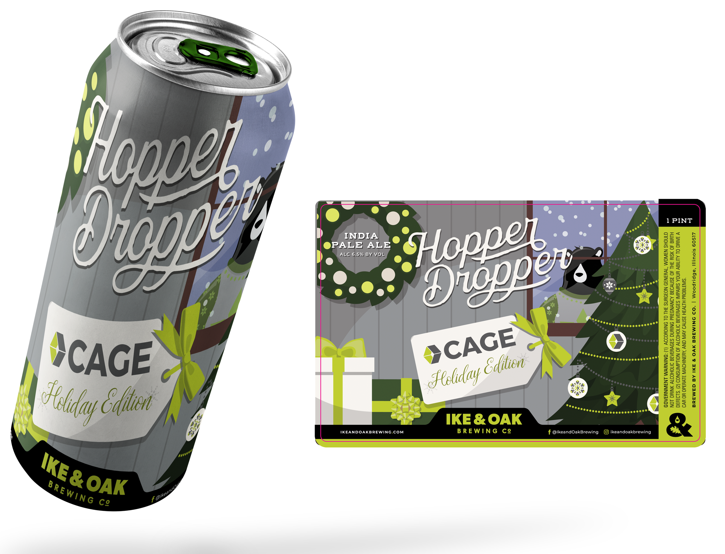
Client: CAGE Engineering
Brief: Create a one-of-a-kind holiday giveaway through the design of a custom branded beer label and packaging experience. The concept combined the established branding of CAGE with the iconic IKE & OAK Black Bear character to build a warm, festive holiday scene that felt both memorable and brand-driven.
Fun Fact: The original concepts for the custom beer label were designed in full color to establish the composition and visual storytelling first. Once the layout was finalized, the artwork was refined into a limited palette of CAGE green and gray — allowing the final design to feel more cohesive with the brand while preserving the character and detail of the illustrated holiday scene.